Accessible explainers are the backbone of science storytelling, distilling complex information into a visually engaging & informative format. Using infographics on websites & social media has been proven to be a more effective medium for your message, helping to expand engagement & reach, driving traffic back to your site.
As a former BBC news science journalist I have a long track record in writing & planning video graphic sequences. I am now combining that experience with my training in Adobe Illustrator & In Design, to create informative & eye-catching infographics for web & social media.
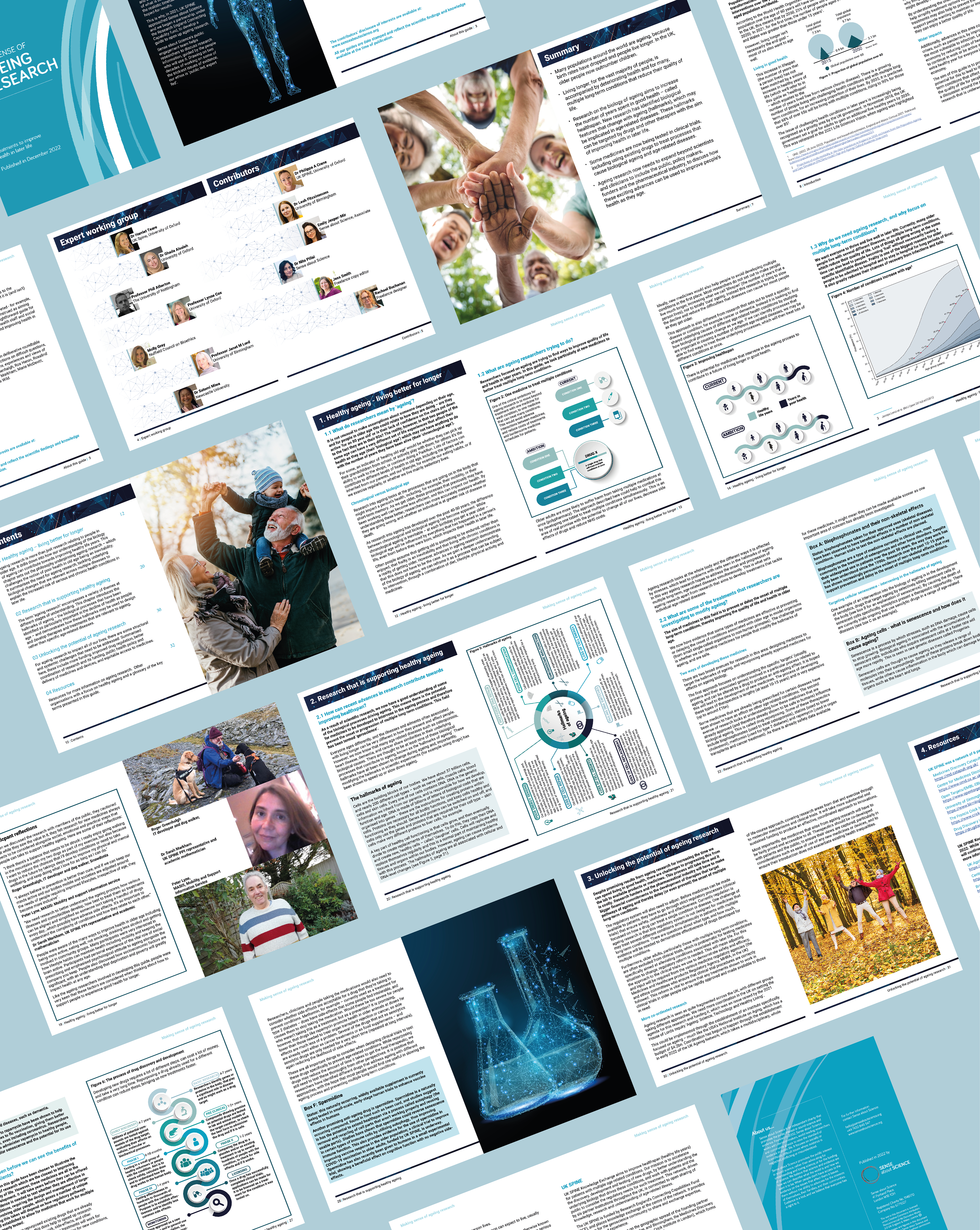
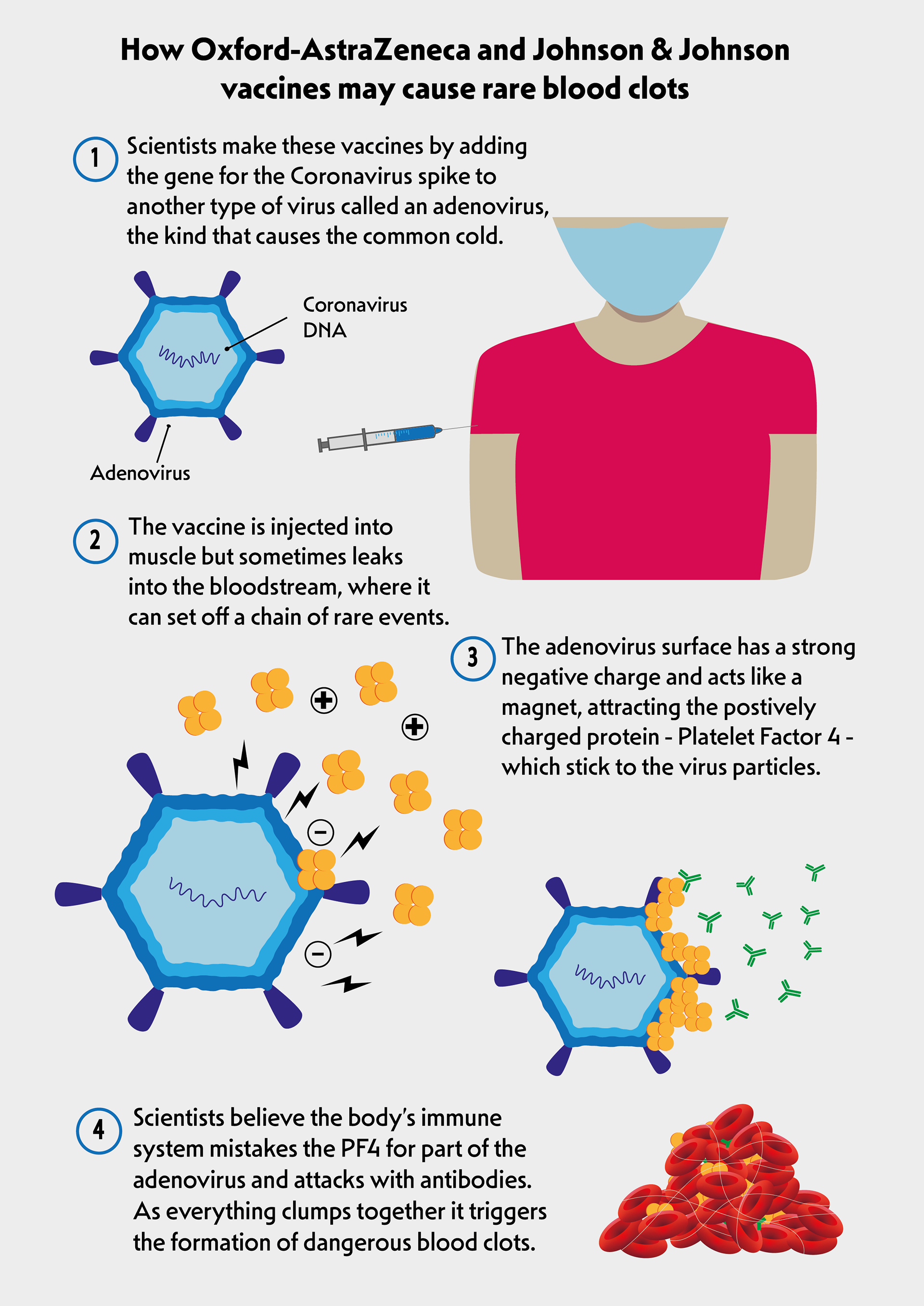
In Autumn 2022 I used InDesign & Illustrator to design and layout a report on ageing research and to create the featured graphics. A collaboration between Sense about Science and UK Spine (a network of geroscience research organisations), the report was a guide to the latest in ageing research, and was published in December 2022.

As COVID-19 spread across the globe it was tracked by a shadow pandemic of false information and conspiracy theories, leaving many wondering how to talk to their firends and family about differing views on what was going on. Sense about Science worked with UKRI to produce a guide to talking about covid conspiracies; which I boiled down into this simple infographic to guide conversations about conspiracy theories.
These are two, of a series of 5 animations I made, to be used as engaging chapterheads for Christ Church videos. I used the Adobe Illustrator files of the motifs from the Foundation's crest and animated them in Adobe After Effects.
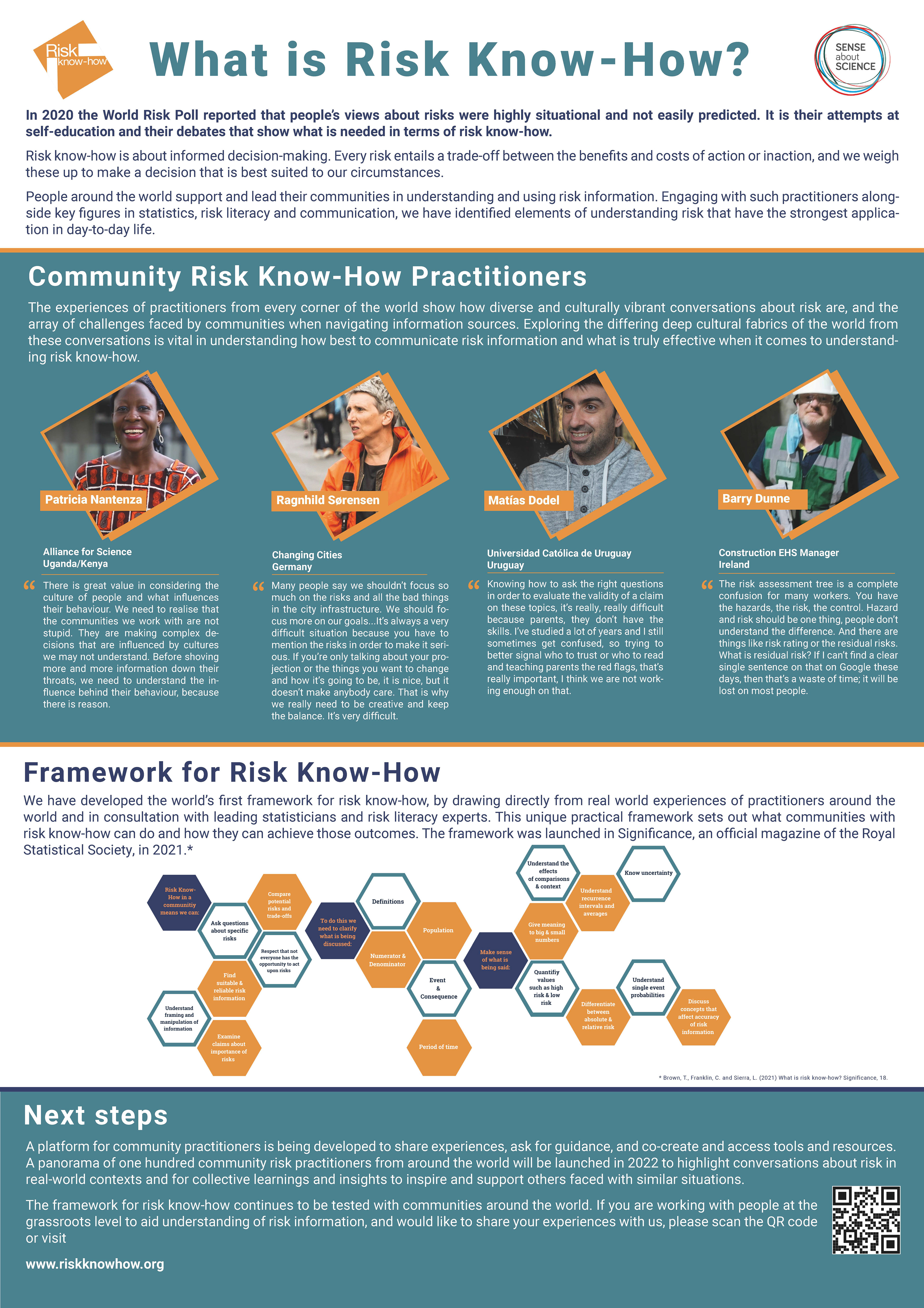
I designed & created this poster for Sense about Science, using Adobe In Design. It details their Risk Know-How project & was displayed at the 2022 LRF Safer World Conference.